The Power of Typography in UX


Typography is an essential but sometimes underestimated element of design. It influences how users perceive and interact with information within digital products. Typography shapes the user experience by ensuring content is both accessible and engaging. Its power lies not only in its visual appeal but also in its ability to guide and inform.
In the realm of UX design, typography serves as the bridge between functionality and aesthetics. It is the medium through which content communicates its message and helps users navigate an interface effortlessly. Typography is central to delivering a seamless user experience, whether it’s choosing the right font, ensuring readability, or leveraging hierarchy to establish focus.
Understanding Typography in UX
Typography is more than arranging letters on a page. It’s the connective tissue between content and the user, ensuring that information is accessible, engaging, and meaningful. Typography is not just about aesthetics; it’s a functional element that can make or break a digital experience.
When users interact with websites or apps, their first impression often hinges on typography. From the body text's legibility to the headings' visual hierarchy, font choices influence how users absorb and navigate content. This makes typography an essential tool in crafting intuitive user experiences.
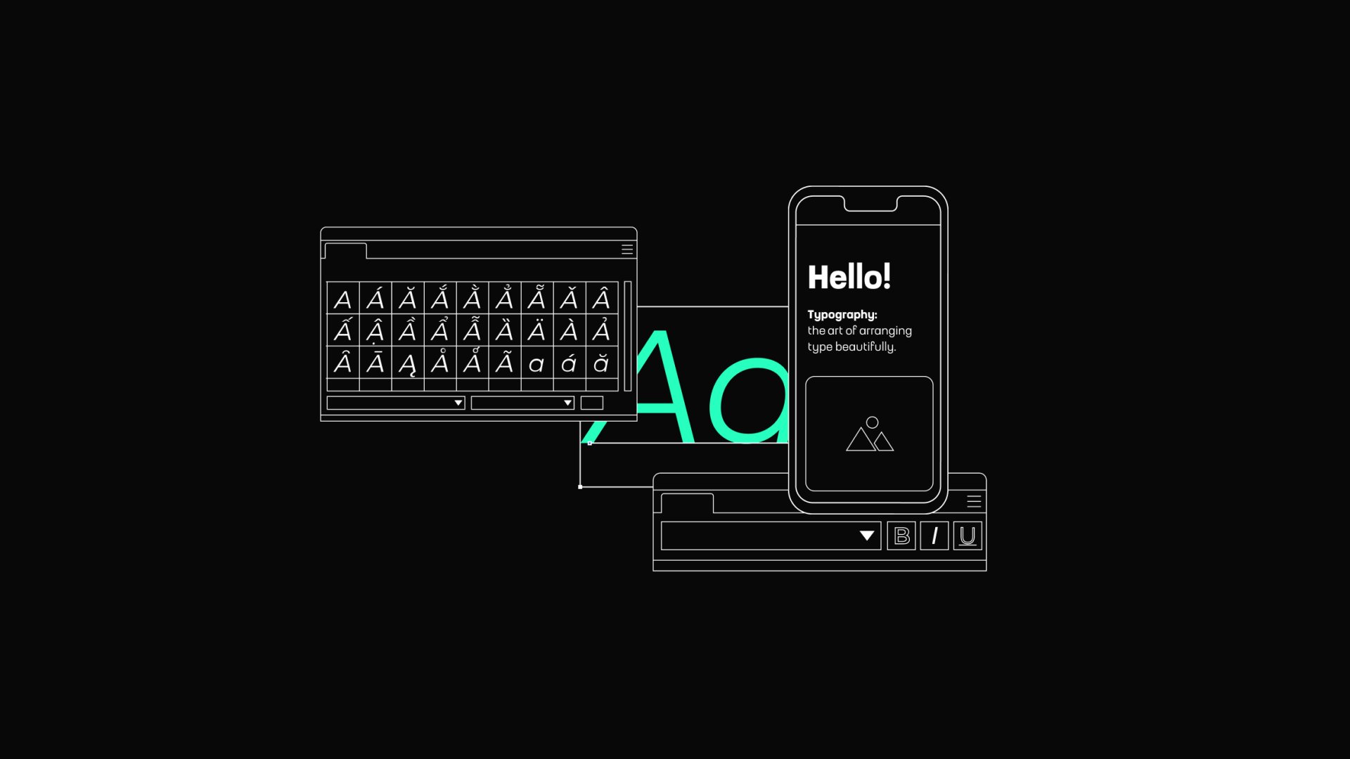
What Is Typography?
In print design, typography’s primary role is to create an aesthetically pleasing and readable layout. However, in UX, the scope widens significantly. Typography in digital products must:
- Adapt to Different Devices: From large desktop monitors to tiny smartwatch screens, the type must remain legible and functional.
- Consider Interactive Contexts: Unlike static print, users interact with digital text through clicks, taps, and scrolls. Typography must support these interactions seamlessly.
- Optimize for Accessibility: Digital typography must accommodate diverse users, including those with visual impairments or cognitive challenges.
Typography in UX is built on a few key elements that dictate its usability and effectiveness:
- Typefaces and Fonts: A typeface is the design of characters (e.g., Helvetica), while a font is a specific style or weight of that typeface (e.g., Helvetica Bold).
- Spacing and Alignment: Proper kerning, tracking, and leading ensure text flows smoothly, while alignment determines how text interacts with surrounding elements.
- Typography Scales: These scales establish proportional relationships between text sizes, contributing to a harmonious and structured design.
Typography as a Problem-Solver
The ultimate goal of typography in UX is to create text that guides users effortlessly through an interface. From headers that grab attention to buttons that prompt action, typography shapes how users experience and navigate a product.
For instance, Airbnb uses its custom typeface, Cereal, to ensure consistency and clarity across its platform. The typeface combines friendly, rounded edges with modern simplicity, reflecting the company’s values of warmth and inclusivity.
In UX, typography is never a second thought. It’s an essential tool for delivering intuitive, accessible, and emotionally resonant experiences. When done right, typography can elevate a product from functional to delightful, making it memorable for users and impactful for businesses.
The Role of Typography in UX
Typography is foundational in UX design, shaping how users interact with and interpret digital content. While often overlooked, typography goes beyond aesthetics to influence readability, usability, and even emotional responses. It’s both a science and an art, bridging the gap between visual appeal and functional communication.
Creating Emotional Resonance
Typography can evoke feelings and set the tone for a digital product. For example:
- Script fonts can convey elegance and sophistication, making them suitable for luxury brands.
- Rounded, playful fonts are ideal for apps targeting children or entertainment.
By aligning typography with a product's emotional goals, designers can strengthen user engagement and create memorable experiences.
Typography as a Tool for Accessibility
Accessibility is a growing priority in UX design, and typography is at the first line of this movement. Designers must ensure that text is readable and usable for all audiences, including those with visual or cognitive impairments.
Best practices for accessible typography include
- There is sufficient contrast between the text and background.
- Adjustable font sizes are available for users who need larger text.
- Avoid overly stylized fonts that can confuse or alienate users.
For example, accessibility-focused platforms like government websites often employ simple, sans-serif fonts with high contrast and generous line spacing, making them usable for a broad audience.
Best Practices for Typography in UX
Creating effective typography in UX design requires a blend of technical knowledge and artistic judgment. The ultimate goal is to use typography that enhances readability, reinforces brand identity, and creates a seamless user experience. Below are essential best practices for using typography effectively in UX design.
Choose Fonts That Reflect Your Brand and Purpose
The font choices should align with the product's tone and purpose. For instance, a tech startup might opt for clean, modern sans-serif fonts, while a publishing platform could benefit from traditional serif fonts to convey trust and authority.
Prioritize Readability and Legibility
Readability refers to how easily users can read and understand content, while legibility focuses on the clarity of individual characters. Both are crucial for an effective user experience.
Tips to enhance readability and legibility
- Choose appropriate font sizes. Body text should typically be 16px to 20px on desktops and slightly larger on mobile devices to accommodate smaller screens.
- Select legible typefaces: Sans-serif fonts like Roboto or Open Sans are often more legible in digital interfaces than serif or script fonts.
- Maintain adequate line spacing. The line height should be 1.5 times the font size to prevent the text from feeling cramped.
For example, a recipe app must ensure that users can easily read instructions on a small kitchen tablet. A clear, sans-serif font with enough spacing can reduce errors and improve the overall experience.
Establish a Clear Typographic Hierarchy
A well-defined hierarchy intuitively guides users through content, making scanning and digesting information easier. Font size, weight, color, and style variations can achieve this.
Key components of typographic hierarchy
- Headlines: Use larger, bold fonts to draw attention to primary information.
- Subheadings: Provide structure with medium-sized text that complements the headline.
- Body Text: Keep it simple and uniform to ensure readability.
- Call-to-Action (CTA): Use distinct styling to make CTAs stand out, encouraging user interaction.
Consider a news app: headlines for breaking news should be bold and prominent, while secondary stories use smaller fonts to create visual distinction. This hierarchy enables users to process information quickly and efficiently.
Maintain Consistency Across Interfaces
Consistency in typography builds familiarity and trust. Users expect the same font styles and sizes across different sections of an app or website, as it reduces cognitive load and fosters a seamless experience.
How to ensure consistency
- Use a typographic scale to standardize font sizes and spacing.
- Create a style guide specifying font families, weights, and colors for headings, body text, and other elements.
- Test typography across various devices and screen sizes to ensure uniformity.
For instance, an e-commerce site with consistent typography (whether users browse on mobile, tablet, or desktop) enhances brand recognition and usability.
Leverage Contrast for Better Visibility
Contrast between text and background is crucial for readability. Poor contrast can make text difficult to read, particularly for users with visual impairments.
Best practices for contrast
- Follow accessibility standards like WCAG, which recommends a minimum contrast ratio of 4.5:1 for regular text and 3:1 for large text.
- Use dark text on light backgrounds or vice versa for maximum visibility.
- Avoid placing text over busy or colorful images unless a contrasting overlay is added.
For example, a travel booking site with white text over vivid destination images should include a semi-transparent dark overlay to enhance readability.
Test Typography in Context
Typography doesn’t exist in isolation; it interacts with other design elements, such as images, buttons, and layouts. Testing how typography functions in real scenarios ensures that it performs as intended.
Testing considerations:
- Simulate various lighting conditions, such as low-light or glare-prone environments, to check for readability.
- Test fonts on different screen resolutions and operating systems to avoid rendering issues.
- Gather user feedback to identify pain points and make improvements.
For instance, a weather app could test how temperature data appears on different devices and adjust font weight or color to enhance visibility.
Incorporate Motion and Micro-interactions
Dynamic typography can add a layer of interactivity and engagement to a design. Subtle animations, such as fading text or responsive resizing, provide feedback and guide users through actions.
Examples of animated typography
- Text that enlarges when hovered over emphasizes clickable elements.
- Animated loading messages, like “Preparing your results,” to keep users informed during delays.
- Smooth transitions between headlines and subheadings for a smooth experience.
For example, a language learning app might animate words as they’re pronounced to reinforce pronunciation cues visually.
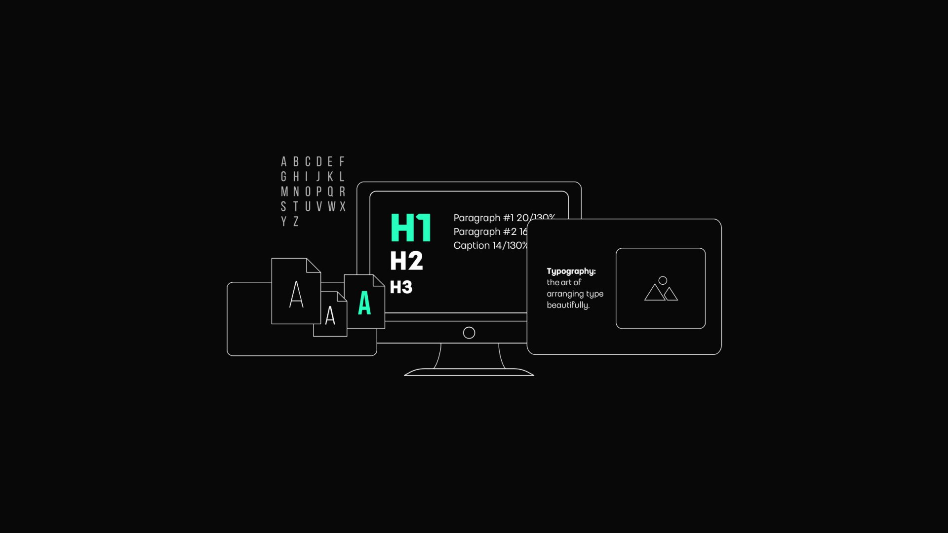
Creating a Typographic System
A typographic system establishes a consistent, cohesive user experience across digital products. It is a foundational framework that organizes text elements, ensuring readability, hierarchy, and visual balance. A well-designed typographic system enhances usability while reflecting the brand’s identity.
Define a Typographic Scale
A typographic scale provides a structured approach to font sizes, ensuring proportional relationships between headings, subheadings, body text, and captions. Establishing a consistent scale creates a visual rhythm that helps users navigate content seamlessly.
How to create a typographic scale
- Use a ratio (e.g., 1.5 or 1.618, the Golden Ratio) to determine font sizes. For instance, if the body text is 16px, headings might be 24px, 36px, and so on.
- Adapt the scale for different devices. While larger screens can accommodate more variation, smaller screens benefit from simpler scales with fewer steps.
For example, a news app can use a typographic scale to differentiate between breaking news headlines and regular articles, making the interface both engaging and scannable.
Choose your Fonts
The font palette is the cornerstone of any typographic system. It typically includes primary and secondary typefaces, each chosen for specific purposes.
Key considerations for font selection
- Readability: Prioritize legible fonts for body text. Sans-serif fonts like Open Sans or Roboto work well for digital interfaces.
- Brand alignment: Select fonts that convey the brand's personality. A playful brand might choose rounded, casual fonts, while a luxury brand could lean towards elegant serifs.
- Performance: Opt for web-safe or variable fonts to ensure fast loading times and compatibility across browsers.
A well-balanced palette might include a bold display font for headlines, a clean sans-serif for body text, and a monospace font for technical elements.
Establish Text Styles
Text styles define the appearance of each typographic element, such as headings, paragraphs, and labels. This step ensures consistency throughout the interface.
Examples of text styles to define
- Headings: For H1, H2, and other levels, include the font size, weight, line height, and spacing.
- Body text: Specify attributes like font size, color, and alignment.
- Special elements: Define styles for buttons, tooltips, and error messages.
For instance, an e-commerce site might use bold, capitalized text for product names, medium-weight text for descriptions, and small, italicized text for disclaimers to ensure clarity and hierarchy.
Define Hierarchical Relationships
A robust typographic system establishes clear relationships between text elements, guiding users through content intuitively. Hierarchy makes interfaces easier to scan and helps users prioritize information.
Ways to establish the hierarchy
- Font size: Use larger sizes for primary content and smaller sizes for secondary details.
- Font weight: Bold text naturally draws attention to important elements.
- Color: Apply contrasting colors for emphasis, but ensure they align with accessibility guidelines.
For example, a project management app might use a bold, large font for task titles, medium-weight text for deadlines, and lighter text for additional notes.
Incorporate Responsive Typography
Responsive typography adapts to different screen sizes, ensuring usability across devices. Text must remain readable and aesthetically pleasing as users interact with content on smartphones, tablets, and desktops.
Best practices for responsive typography:
- Use relative units like “em” or “rem” instead of fixed pixels to allow scalability.
- Implement fluid typography, where font sizes adjust dynamically based on screen dimensions.
- Test typographic elements in both landscape and portrait orientations.
For example, a fitness app could increase the font size for step counts on a smartwatch while retaining smaller sizes for less critical details.
Leverage Spacing and Alignment
Spacing is crucial for the readability and aesthetic appeal of text. Proper line spacing, margins, and alignment contribute to a polished design.
Key spacing considerations:
- Line height: Set line height to approximately 1.5x the font size for body text.
- Paragraph spacing: Maintain sufficient spacing between paragraphs to enhance readability without overwhelming the layout.
- Alignment: Stick to left-aligned text for most content, as it’s easier to read than centered or justified text in digital interfaces.
A blog platform, for example, could use generous spacing between paragraphs and headings to create a clean, user-friendly layout.
Add Interactive Typography
Interactive typography involves dynamic text elements that respond to user actions, adding an extra layer of engagement to the design.
Examples of interactive typography
- Hover effects that change the text color or underline links.
- Animations, such as fading in headlines or resizing CTAs based on user interaction.
- Adaptive type that adjusts font size based on user preferences or accessibility settings.
For example, a travel booking site could use animated text to highlight limited-time offers, capturing attention without disrupting the user journey.
Document and Share Your System
Once your typographic system is complete, document it thoroughly and share it with your team. A well-documented system ensures project consistency and helps new team members understand the design language.
Documentation essentials
- Include visual examples of text styles and their use cases.
- Provide guidelines for applying the system across devices and platforms.
- Update the document regularly to reflect changes or improvements.
A platform like Figma can be used to create and share typographic guidelines, ensuring alignment across design and development teams.
Typography Pitfalls to Avoid
Typography is a cornerstone of UX design, but even small missteps can negatively impact usability and the overall experience. Designers must balance creativity with practicality to ensure that typography effectively serves its purpose.
Poor Readability
One of the most critical typography mistakes is sacrificing readability for aesthetic appeal. Fonts that are too small, overly stylized, or have insufficient contrast can frustrate users, especially on digital screens.
Common readability issues to avoid
- Fonts that are too decorative or intricate for body text.
- There is low contrast between text and background colors.
- Overly tight or loose letter spacing and line spacing.
How to address it
- Use simple, legible fonts for the main content
- Follow accessibility guidelines, ensuring sufficient contrast
- Test readability on multiple devices, from small smartphones to large desktop monitors.
For instance, in a mobile banking app, using a gray font on a white background can make transaction details difficult to read, leading to user dissatisfaction.
Overloading with Too Many Fonts
Using multiple fonts without purpose can create a cluttered and inconsistent design, making it difficult for users to focus on the content. This is particularly problematic in digital interfaces where simplicity is key.
Signs of font overload
- Mixing more than three different typefaces in a single interface.
- Inconsistent font usage across headings, body text, and buttons.
- Using fonts with contrasting styles that clash visually.
How to fix it
- Limit your font palette to two or three complementary typefaces: one for headings, one for body text, and an optional one for accents.
- Maintain consistency in font choices across all components of the design.
- Choose fonts that align with the brand’s identity and tone.
For example, pairing bold serif fonts for headings with clean sans-serif fonts for body text creates a balanced and professional look.
Ignoring Hierarchy
Typography without a clear hierarchy forces users to work harder to navigate the content. If everything looks the same, users won’t know where to focus their attention, leading to confusion and a poor experience.
Common hierarchy mistakes
- Using similar font sizes for headings and body text.
- Failing to differentiate primary and secondary content visually.
- Overusing bold or italic styles makes the design chaotic.
How to address it
- Define clear roles for each text element, such as H1 for main titles, H2 for subtitles, and body text for detailed content.
- Use varying font sizes, weights, and colors to establish relationships between elements.
- Apply consistent spacing to separate sections and guide the eye.
A news app, for instance, can use bold, large fonts for headlines, smaller fonts for summaries, and even smaller fonts for publication details to maintain clarity.
Neglecting Accessibility
Typography that doesn’t account for users with visual impairments or cognitive challenges risks alienating a portion of the audience. Accessibility is not optional; it’s a necessity in modern UX design.
Accessibility pitfalls to avoid
- Using fonts that are too small or thin makes them hard to read.
- Over-relying on color to convey meaning may not be visible to colorblind users.
- Using justified text, can create uneven spacing and disrupt readability.
How to ensure accessibility
- Follow WCAG (Web Content Accessibility Guidelines) to meet minimum font size and contrast requirements.
- Incorporate tools like text-to-speech compatibility and resizable fonts for user customization.
- Avoid decorative fonts in critical areas like forms or instructions.
For example, an e-commerce site could allow users to adjust text size for easier reading, improving accessibility and user satisfaction.
Failing to Optimize for Different Devices
Typography that looks great on a desktop might not translate well to smaller screens, such as smartphones or smartwatches. Failing to optimize for various devices can harm the overall experience.
Optimization mistakes to avoid
- Using fixed font sizes that don’t adjust to screen dimensions.
- Overly complex typographic layouts that don’t scale down effectively.
- Ignoring line length and spacing considerations for smaller screens.
How to address it
- Use responsive typography that adjusts font sizes and line spacing based on the device.
- Test designs on different screen sizes to ensure text remains readable and visually appealing.
- Stick to shorter line lengths for small screens to prevent overwhelming the user.
For instance, a fitness app should use large, clear text for metrics like step counts on smartwatches, ensuring legibility even at a glance.
Overlooking Spacing and Alignment
Spacing and alignment are often underestimated but crucial to creating a polished, professional design. Crowded text or uneven alignment can make interfaces feel disorganized and difficult to use.
Spacing mistakes to avoid
- Crowding text elements too close together.
- Failing to provide enough padding around the text.
- Misaligned text that disrupts visual flow.
How to fix it
- Set consistent line spacing.
- Use generous margins and padding to create breathing room.
- Align text consistently, whether left-aligned for body text or center-aligned for headings.
For example, a meditation app could use spacious layouts and centered headings to create a calming and organized experience.
The Emotional Impact of Typography
Beyond functionality, typography has a great emotional dimension. When used thoughtfully, typography enhances a product's and its users' emotional connection, shaping how they perceive and interact with a brand or interface. It communicates mood, values, and brand personality, shaping user perceptions and engagement.
Establishing Brand Identity
Typography is central to branding. Consistent use of fonts strengthens recognition and reinforces brand values. For example, a bold, geometric font might signal innovation, while a serif font might convey reliability.
Eliciting Emotional Responses
Typography can evoke specific emotions. Script fonts, for instance, might evoke nostalgia or romance, while clean, sans-serif fonts convey modernity and efficiency.
Encouraging Interaction
Well-crafted typography can guide users toward desired actions. For example, a bold, vibrant font can make call-to-action buttons more engaging.
The Future of Typography in UX
As UX design evolves, typography continues to adapt to emerging technologies. The rise of voice interfaces, augmented reality (AR), and virtual reality (VR) is pushing designers to rethink traditional approaches to typography. The text must now function in dynamic, three-dimensional environments while remaining readable, legible, and engaging.
For instance, AR applications might overlay floating text onto the real world, requiring typefaces that remain clear against various backgrounds. Meanwhile, in VR, typography must account for depth, scale, and user perspective.
By embracing innovation while adhering to core usability principles, typography will remain a powerful tool for shaping the digital experiences of tomorrow.
Conclusion
Typography is the unsung hero of UX design. It bridges the gap between aesthetics and functionality, ensuring that users can effortlessly navigate interfaces, consume content, and engage with digital products. By focusing on readability, hierarchy, and emotion, designers can elevate the user experience and create products that resonate on a deeper level.
As digital products continue to evolve, typography will become increasingly important. Designers who master the art of typography will enhance usability and craft memorable and emotionally impactful experiences for their users.