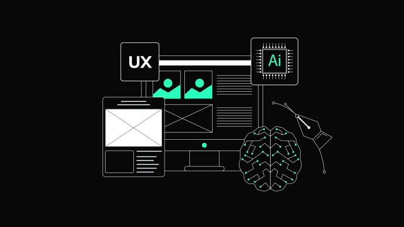
The Role of Microinteractions in UX Design

Often, the smallest details leave the most lasting impressions. Microinteractions, those subtle animations or feedback responses triggered by user actions, play a critical role in creating seamless, engaging digital experiences. While they might seem minor additions, they can significantly influence usability, guide user behavior, and strengthen users' emotional connection with a product.
Whether it’s how a button lights up when clicked, the confirmation animation after sending a message, or the haptic feedback when unlocking a phone, microinteractions enhance the overall experience by making it feel intuitive, responsive, and delightful.
We explored the importance of microinteractions, their core components, and practical examples of how they are used to improve user experience. We also dived into best practices for designing micro-interactions, their challenges, and their growing role in the future of UX design.
What Are Microinteractions?
Microinteractions are the subtle design elements that respond to user actions in an interface. They are everywhere in digital products, yet their presence is so seamless that users might not consciously notice them. These moments of interaction are designed to provide feedback, enhance usability, and add a touch of personality to digital experiences.
At their core, microinteractions serve as bridges between users and interfaces, offering cues that inform and confirm. For example, the vibration of a smartphone when a message is sent, a subtle loading spinner after a button is clicked, or the way an icon changes when toggled are all examples of microinteractions. They play a crucial role in ensuring that users understand the system's state and feel in control during their journey.
Microinteractions consist of four primary components:
- Trigger – This initiates the microinteraction, either through a user action (e.g., clicking a button) or a system event (e.g., receiving a notification).
- Rules – These determine what happens once the trigger is activated, defining the behavior of the micro-interaction.
- Feedback is the response users see, hear, or feel, such as an animation, sound, or haptic vibration.
- Loops and Modes – These handle the ongoing behavior of the micro-interaction, such as how it resets or adapts over time.
Microinteractions are not limited to specific actions; they include a wide range of experiences:
- Response: When users take action, they expect acknowledgment. For instance, pressing a “Like” button might result in a heart icon filling up with a smooth animation, letting users know their action was successful.
- System Status Updates: Microinteractions communicate system states, such as loading progress or connection errors. A pulsing circle on a loading screen reassures users that the system works.
- Data Input Assistance: From autofill suggestions in forms to instant validation for input fields (like showing a checkmark for a valid password), microinteractions make processes smoother and more intuitive.
- Navigation: Hover effects, menu transitions, and swipe gestures guide users through an interface, enhancing navigation without overwhelming them.
- Delight and Engagement: Playful elements, like confetti animations when a task is completed, create moments of joy that resonate with users.
These tiny details might seem trivial at first glance, but they have a powerful impact. Microinteractions make interfaces feel alive, reducing cognitive load and reinforcing user trust. By addressing user needs at a granular level, they help create a seamless, enjoyable experience that keeps users engaged.
Microinteractions ensure that users feel guided, informed, and delighted, shaping their overall product perception. Whether they communicate status, provide feedback, or simply add a touch of fun, microinteractions are integral to modern user experience design.
Why Are Microinteractions Important in UX?
Enhancing Usability
One of the primary purposes of micro-interactions is to make interfaces more user-friendly. They reassure users that their actions have been registered by providing instant feedback.
Example: Imagine filling out a form without any feedback. You press “Submit,” and nothing happens immediately. Was the form submitted, or did you miss a required field? A simple micro-interaction eliminates this uncertainty like a spinning loader followed by a confirmation message.
Guiding User Behavior
Microinteractions act as silent guides, helping users navigate complex interfaces without requiring lengthy instructions. They can subtly highlight available actions or point out errors, ensuring smoother interaction.
Example: On e-commerce sites, additional options like “Quick View” or “Add to Cart” often appear when users hover over a product image. This micro-interaction encourages users to engage further without overwhelming them initially.
By using visual or tactile cues, microinteractions guide users toward their goals in a natural, non-intrusive way.
Creating Delightful Experiences
Delightful moments make users feel emotionally connected to a product. Microinteractions inject personality and charm into digital experiences, making them memorable.
Example: A fitness-tracking app might celebrate user milestones, such as completing a workout goal, with playful animations or confetti effects. These interactions make the experience feel rewarding and encouraging.
While they don’t directly impact functionality, these delightful touches contribute to positive user perception and foster brand loyalty.
The Growing Importance of Microinteractions
As digital products become more advanced and user expectations rise, microinteractions evolve from “nice-to-have” elements to critical components of good design. Today’s users demand instant feedback, personalized experiences, and intuitive navigation.
Additionally, as more industries adopt digital-first approaches, the competition to deliver exceptional user experiences grows. Microinteractions offer a way to differentiate products by adding a layer of sophistication.
Best Practices for Designing Microinteractions
Keep Them Subtle and Functional
The best microinteractions blend seamlessly with the overall design. They should enhance the experience without drawing unnecessary attention. Avoid overly elaborate animations or sounds that might distract users or slow down the interface.
Match the Micro-interaction to the Context
Microinteractions should align with the application's purpose and tone. For instance, a serious banking app might prioritize clean, professional feedback, while a children’s game can be more playful. Design micro-interactions that reflect the brand’s personality and audience expectations.
Test Across Devices and Accessibility Needs
Micro-interactions should work flawlessly on all devices. For example, haptic feedback is useful for mobile users, but alternatives like visual animations or sounds should be available for those without access to haptics. Test micro-interactions with screen readers, high-contrast modes, and different input methods to ensure accessibility.
Iterate Based on User Feedback
What works well for one group of users might not work with others. Testing and iteration are key to optimizing micro-interactions. Use analytics and user feedback to refine micro-interactions and identify opportunities for improvement.
Effective Microinteraction Examples
Microinteractions play a vital role in enhancing user experiences, and some of the most effective examples are already embedded in our daily digital interactions. Let’s dive deeper into a few impactful instances of micro-interactions and their real-world applications.
Skeleton Screens
Skeleton screens are placeholders that appear while content is loading. Unlike traditional loading spinners, which provide no context, skeleton screens give users a sense of structure and progress. For example, a news app might show greyed-out placeholders for headlines and images, allowing users to anticipate the layout of the content as it loads.
This technique is effective because it reduces perceived waiting time. Instead of staring at a blank screen, users feel reassured that content is coming. Skeleton screens also create an impression of speed, even if the loading process takes the same amount of time as it would with a spinner. They’re a great way to maintain user engagement during transitions.

Hover Effects
Hover effects are subtle animations triggered when users move their cursor over an element. These interactions provide instant feedback, indicating that an element is interactive. For instance, a “Buy” button might slightly enlarge or change color when hovered over, signaling its importance.
Another example could be product images in an e-commerce store. Hovering over an image might reveal alternate views of the product or additional details like price. Hover effects are very useful in guiding user behavior and making interfaces feel responsive and alive.
Notifications and Alerts
Microinteractions enhance the impact of notifications and alerts. When you receive a new message in a chat app, a subtle animation like a bubble appearing or vibrating can catch your attention without being overly disruptive. Similarly, email clients often use animations to show unread messages being added to the inbox, creating a seamless user experience.
One of the most engaging examples is when notifications are paired with sound or haptic feedback. For instance, a gentle chime when a task is completed, or a vibration for urgent notifications makes the interaction multi-sensory, improving user recall and immediacy.
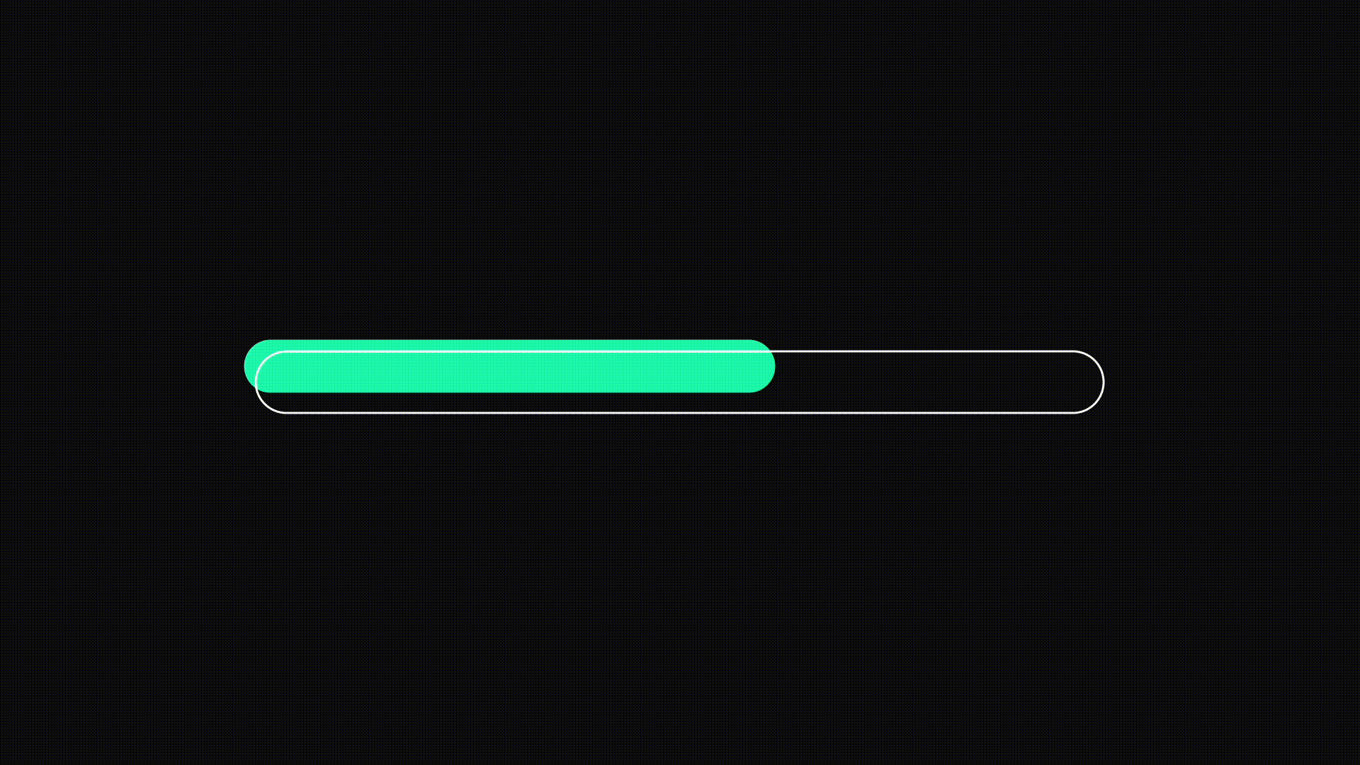
Progress Indicators
Progress indicators, such as loading bars or checkmark animations, keep users informed during lengthy processes. For example, when uploading files to a cloud storage app, users often see a percentage bar that fills up. Upon completion, a satisfying checkmark or confetti animation provides closure and a sense of accomplishment.
A more advanced take on this could include playful animations, like a rocket moving along the bar as progress is made, keeping the user engaged while waiting.
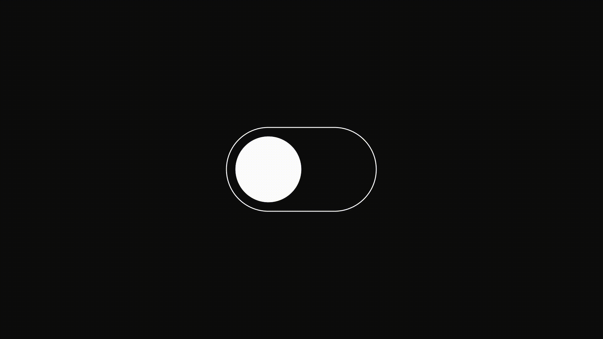
Toggle Switches
A toggle switch is a classic example of a micro-interaction that provides visual and functional feedback. Modern toggles often mimic physical switches, creating an intuitive experience.
For instance, toggling a light switch in a smart home app might result in a subtle animation showing the light turning on or off, accompanied by a faint glow around the switch. This kind of feedback makes the interaction feel real and builds user trust in the app's responsiveness.
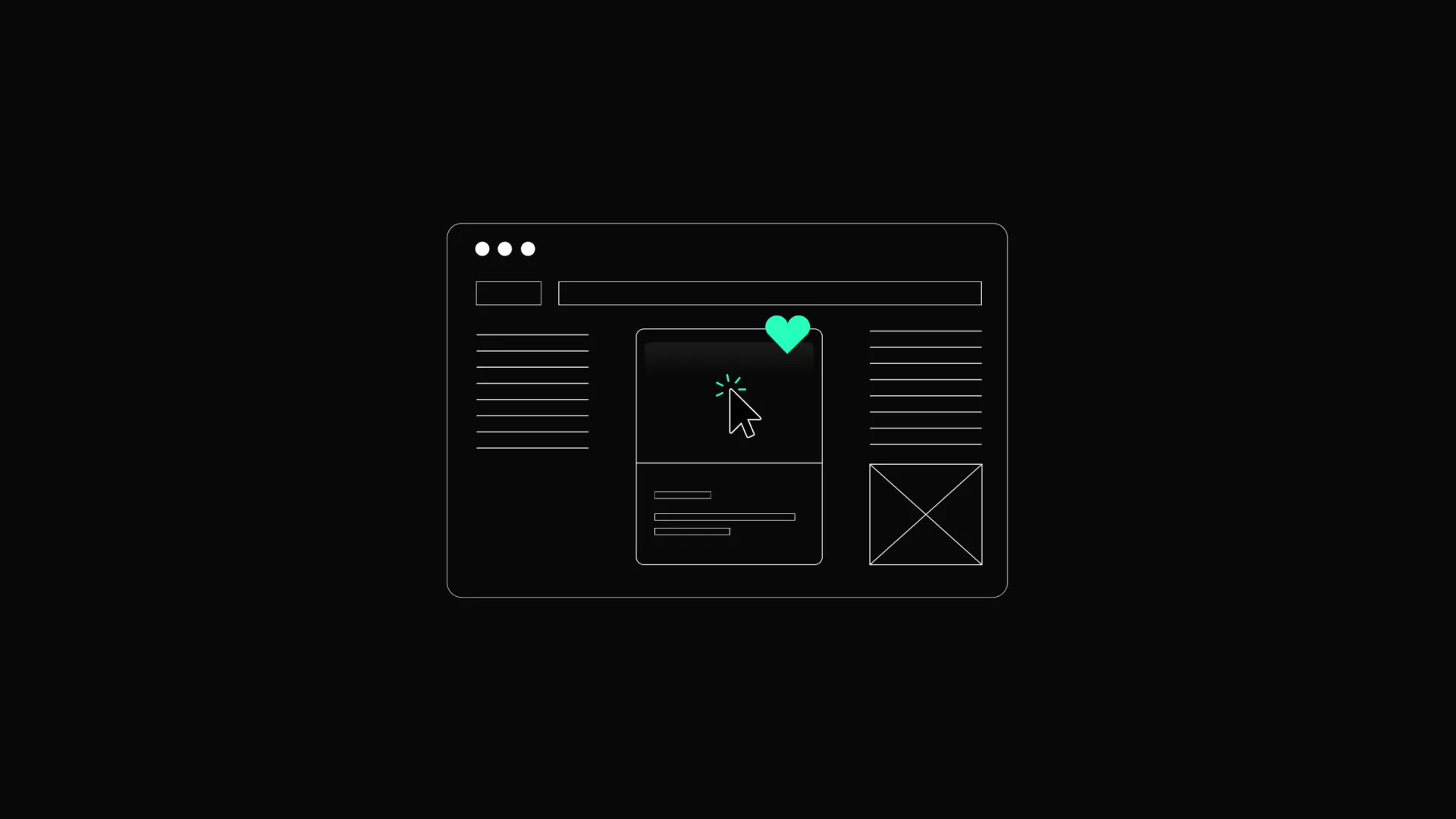
Like and Share Animations
The “like” button on social media platforms has become iconic due to its micro-interaction design. For instance, tapping the heart icon on Instagram triggers a small explosion of hearts, creating a delightful and rewarding user experience. Similarly, a share button might animate into a paper plane or expand with options for sharing via different platforms.
These small touches can significantly increase engagement and encourage users to perform more actions.
Search Feedback
When users type in a search bar, immediate visual feedback, such as suggestions, appears, indicating that the app is processing the query. For example, Google’s search bar shows dynamic suggestions as users type, helping them refine their searches in real-time.
Interactive search feedback can also include a subtle “loading” icon, ensuring users know the system is working on their request, especially for more complex queries.
Pull-to-Refresh Animations
Pull-to-refresh is a widely used interaction in apps like Twitter and email clients. Users who pull down on the screen to refresh content are often greeted with a playful animation, such as a spinning arrow or a bouncing icon. This interaction combines functionality with visual delight, making repetitive tasks less boring.
An innovative example is using a thematic animation, such as a growing plant or rising sun, to reflect progress during the refresh process.
Drag-and-Drop Interfaces
Drag-and-drop interactions are a dynamic way to move or organize items. For instance, a task management app might allow users to drag tasks between categories, with animations that show the task "snapping" into its new location. This immediate feedback ensures the user knows the action was successful.
To make it even more engaging, the app could show a slight resistance effect when dragging, mimicking the feeling of moving a physical object.
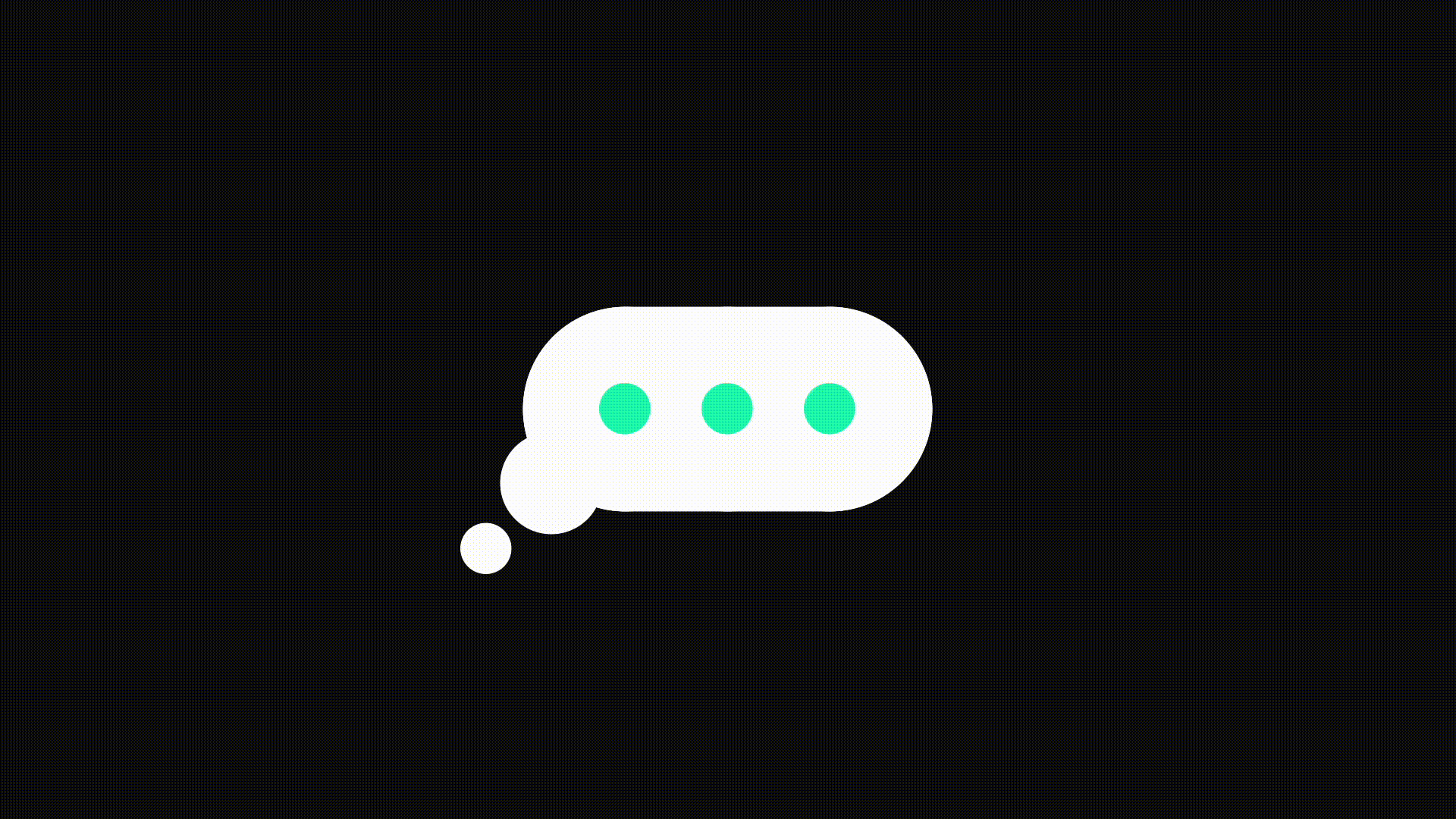
Typing Indicators
Typing indicators are subtle yet powerful micro-interactions commonly found in messaging apps. The familiar “three-dot” animation lets users know the other person is typing, reducing uncertainty and keeping the conversation flow intact.
Some apps even enhance this interaction by displaying the message preview in real-time, offering a sneak peek at what’s being typed. This helps users stay engaged while they wait for a response.
How to Incorporate Microinteractions in Your Design
Successfully incorporating micro-interactions into your design requires planning, creativity, and attention to detail. Microinteractions should look appealing and serve a functional purpose, enhancing the overall user experience.
Define the Purpose of Each Microinteraction
Start by identifying what you want the microinteraction to achieve. Is it to provide feedback, guide user behavior, or create a moment of delight? Each micro-interaction should have a clear purpose tied to the user’s needs and the app’s goals.
For example, if you aim to reduce form submission errors, you might design an error microinteraction that highlights incorrect fields with a subtle shake animation. On the other hand, if you want to reward users for completing a task, a celebratory confetti animation or a glowing checkmark can leave a positive impression. Defining the purpose ensures that the micro-interaction aligns with the broader functionality and doesn’t feel out of place.
Focus on Key Touchpoints
Not every part of your interface requires microinteractions. Overusing them can create visual clutter and detract from usability. Instead, focus on critical touchpoints where users make decisions or need confirmation.
For example, consider moments like clicking a “Submit” button, navigating between screens, or toggling settings. A well-placed micro-interaction, such as a button that subtly animates when pressed, can enhance these touchpoints without overwhelming the user.
To identify these touchpoints, map out the user journey and highlight areas where feedback or guidance could improve the experience. This will help you pinpoint where micro-interactions will have the greatest impact.
Keep Microinteractions Subtle and Consistent
Successful micro-interactions are key to subtlety. They should complement the interface without drawing excessive attention. For example, a hover effect on a menu item should be noticeable enough to indicate interactivity but not so flashy that it distracts from the main content.
Consistency is equally important. Microinteractions should follow a cohesive design language that aligns with the app’s overall aesthetic. Consistency across the interface ensures users can intuitively understand and predict interactions, improving usability.
Use Timing and Animation Wisely
Timing and animation play a crucial role in how users perceive microinteractions. Smooth transitions and appropriately paced animations can make interactions feel more natural.
Avoid overly long or exaggerated animations, which frustrate users and slow interactions. Use animation sparingly to ensure optimal performance. Lightweight animations that don’t overload the system are especially important for mobile apps or devices with limited processing power.
Incorporate Feedback Loops
Microinteractions are a great way to provide real-time feedback to users. Whether a confirmation checkmark appears after a successful action or a progress bar shows the upload status, feedback loops reassure users that their actions have been recognized and processed.
For instance, an email app might display a quick animation of an envelope opening when a message is sent, visually confirming the action. Without such feedback, users might feel unsure whether their action was completed successfully.
Feedback loops should be clear and immediate, ensuring users don’t have to guess the outcome of their actions.
Prioritize Accessibility
Designing microinteractions with accessibility in mind ensures that all users can benefit from them. Use inclusive animations and visual cues that don’t rely on just one sensory input, like color or sound.
For instance, pairing visual feedback with haptic feedback can enhance accessibility for users with visual or auditory impairments. Providing alternatives like text descriptions for animations can also improve inclusivity.
Accessibility testing should be an integral part of your design process to ensure that micro-interactions meet the needs of diverse user groups.
Test and Iterate
Testing is essential to ensure microinteractions function as intended and enhance the user experience. Collect feedback from real users to understand how they perceive and interact with the animations. Are they helpful? Do they feel intuitive, or do they distract from the main tasks?
For example, you might discover through testing that users find a button animation too subtle to notice, prompting you to make adjustments. The iterative design ensures that your microinteractions are continuously refined based on user behavior and feedback.
Balance Creativity and Functionality
While microinteractions allow for creative freedom, it is important to balance aesthetics with functionality. Overly detailed animations can confuse users and distract them from the interface's main purpose. For example, a playful confetti animation might work well for a social media app but feel out of place in a professional document editor.
Always prioritize clarity and usability, ensuring that microinteractions add value to the user experience rather than serving as mere decoration.
Leverage Design Systems and Tools
To streamline microinteraction integration, use design systems and tools that provide reusable components and guidelines. Tools like Figma, Adobe XD, or Prototyping software like Framer allow you to create and test animations directly within your design workflow.
For example, you can develop a library of micro-interaction templates for buttons, toggles, or progress indicators, ensuring consistency across the interface. Design systems also help teams collaborate efficiently, ensuring micro-interactions align with the broader design language.
Challenges and Considerations
While microinteractions can greatly enhance the user experience, implementing them is challenging. Designers and developers must consider several considerations to ensure they are effective and practical.
Avoiding Overuse
One of the biggest pitfalls is overloading an interface with too many microinteractions. While they can make a design more engaging, extreme animations or feedback elements can overwhelm users and detract from usability.
For example, imagine a social media app where every interaction triggers a unique animation. This could quickly become chaotic and distracting, reducing the overall user experience.
To avoid overuse, focus on the most critical touchpoints where microinteractions provide the greatest value, such as confirming an action or drawing attention to key elements. Prioritize subtlety and ensure each animation serves a purpose.
Balancing Aesthetics with Functionality
Microinteractions must strike a balance between looking appealing and serving a functional purpose. Overly complicated animations can slow interactions, frustrate users, or make the interface unresponsive.
When designing microinteractions, ensure they contribute to a seamless experience. Consider performance constraints and test animations across devices to ensure they work as intended without compromising speed or usability.
Maintaining Accessibility
Not all users experience microinteractions the same way. For instance, users with visual impairments might miss subtle visual animations, while users with motor impairments might struggle with gesture-based interactions. Designers must ensure that microinteractions are inclusive and accessible.
Test microinteractions with screen readers and ensure they comply with accessibility guidelines, such as WCAG (Web Content Accessibility Guidelines).
Performance Impacts
Animations and dynamic interactions can be resource-intensive, especially on older devices or slower internet connections. Poorly optimized microinteractions can lead to lag, negatively impacting the overall user experience.
Optimize your animations by using lightweight assets and minimizing unnecessary effects to mitigate performance issues. Work closely with developers to implement efficient coding practices, ensuring microinteractions don’t tax system resources.
Designing for Intuition
Microinteractions should feel natural and intuitive, but achieving this can be challenging. If the feedback is too subtle, users might not notice it, and if it’s too complex, they might misinterpret its purpose.
For example, a toggle switch with an unclear animation might leave users uncertain whether their action succeeded. To ensure intuitiveness, align animations with users’ mental models and expectations. Use common design patterns that users are already familiar with, such as progress bars or hover effects.
Aligning with Brand Identity
Microinteractions should enhance the overall brand experience, but they can sometimes feel disconnected if not carefully aligned with the brand’s identity.
To maintain brand consistency, use design systems that define how microinteractions should look and feel. Ensure animations, colors, and transitions align with the brand's tone and personality. This creates a consistent experience that reinforces brand recognition.
Staying Relevant Over Time
Design trends evolve quickly; microinteractions that feel cutting-edge today may seem outdated in a few years. Overly trendy animations might also clash with the timelessness of your product’s design.
To ensure longevity, focus on functional microinteractions that serve a clear purpose rather than relying solely on trendy visual effects. Subtle and user-centric animations are less likely to feel dated and can adapt to changing trends with minor adjustments.
Integration with Development Processes
Finally, integrating microinteractions into development workflows can be challenging, particularly if the design and development teams are not closely aligned. Poor communication can result in micro-interactions that differ from the original design vision.
Clearly, document design specifications, including animation timing, easing functions, and trigger conditions, to ensure consistent implementation.
Conclusion
Microinteractions may be small, but their impact on UX design is enormous. By enhancing usability, guiding behavior, and adding moments of delight, they transform digital experiences into something users enjoy and remember. As technology evolves, these tiny interactions will continue to play a big role in crafting user-friendly and emotionally engaging products.