Whitespace in Web Design: Improving User Experience

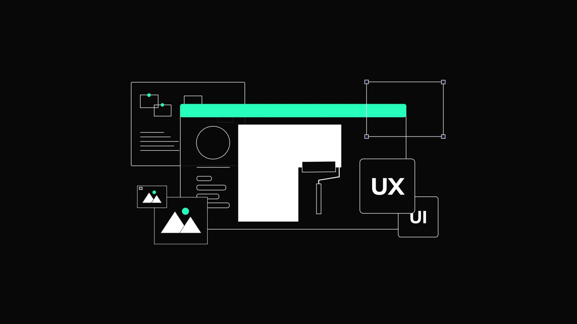
In today's digital world, websites are more than just places for information. They represent businesses and serve as interaction hubs. A key element affecting how users see and use a website is whitespace, also called negative space.
Whitespace refers to the empty spaces between elements in a design. It’s not just about the color white, but the absence of other design elements like text, images, or buttons. Even though it might seem strange, using empty space can make a website work better and look nicer.
Understanding Whitespace
Whitespace is the quiet part of the design. It’s the area between different elements in a design. There are two types of whitespace: macro whitespace and micro whitespace.
Macro whitespace refers to the larger spaces between major elements in a layout, like the space between blocks of text and images.
Micro whitespace is the smaller space between smaller elements, like the space between letters, words, and lines of text.
Both types of whitespace are important for creating a balanced and harmonious design. They help guide the user’s eye and make the content easier to read and engage with.
The Impact of Whitespace on User Perception
Improving Readability and Understanding
Whitespace affects how easy it is to read a website. When text is pressed together with little space, it becomes hard to read and understand. By adding enough whitespace around text blocks, paragraphs, and lines, designers can make the text easier to read. This helps users read comfortably without stressing their eyes, making the reading experience more enjoyable and efficient.
Enough space around text also helps to break up information into smaller parts. This technique is useful for long articles or data-heavy content, making it easier for users to scan and find the necessary information. Proper use of whitespace ensures that text doesn’t feel overwhelming, improving understanding of the content.
Enhancing Focus and Attention
A cluttered interface can overwhelm users and distract them from the main message or action. Whitespace helps direct users' attention to the most important parts of the page. By placing whitespace around key elements like headlines, buttons, and images, designers can make these components stand out. This helps users quickly find what they are looking for and engage with the content more effectively.
Whitespace also helps guide the user's journey through a website. By creating clear paths with enough space around clickable elements, designers can lead users through the desired flow of actions, improving the overall user experience. Reducing visual mess makes it easier for users to process information, making them more likely to complete desired actions like filling out a form or making a purchase.
Creating Visual Order
Visual order is how elements are arranged to show importance. By using different amounts of space around elements, designers can show users which parts of the content are most important. For example, more whitespace around a headline or call-to-action button makes it more noticeable, while less space around less important elements makes them less prominent. This order helps users move through the content logically, improving their overall experience.
Good use of whitespace also improves balance and organization. When elements are properly spaced, the page feels more harmonious and structured. This balance helps users navigate the site intuitively, as the relationships between different sections and elements are clearly defined. A well-organized layout with thoughtful use of whitespace ensures that users do not feel lost or overwhelmed, making browsing more enjoyable and efficient.
Reducing Mental Effort
Mental effort, also known as cognitive load, is the amount of mental work needed to process information. A design with too much information and little whitespace can overwhelm users and make it harder for them to find and understand the information they need. This can be reduced by breaking up the content into smaller parts and providing visual breathing room. This makes it easier for users to focus, process, and remember the information presented.
Designers can create user-friendly interfaces by minimizing distractions and presenting information clearly and simply. Whitespace helps to simplify complex information and guide users' attention to what matters most, improving their overall understanding and satisfaction. Reducing mental effort is especially important for users with short attention spans or those accessing the site on mobile devices, where screen space is limited.
Delivering Elegance and Quality
Whitespace can also make a website look more elegant and of high quality. Many luxury brands use a lot of whitespace to create a sophisticated and refined appearance. This makes the website look better and also aligns with the brand’s image and values. A clean, uncluttered design with plenty of whitespace can make a website feel more professional and trustworthy, encouraging users to engage more with the content.
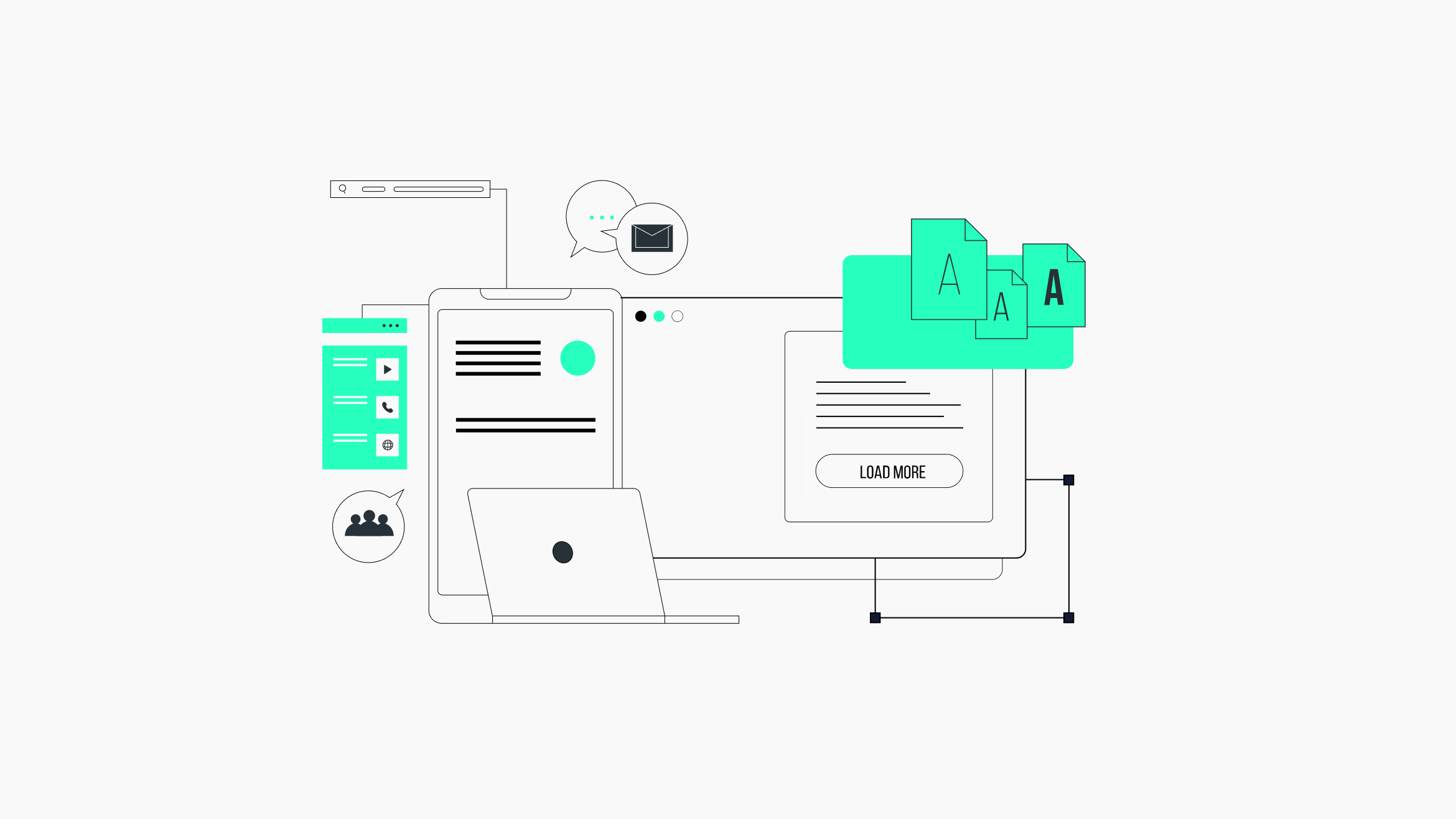
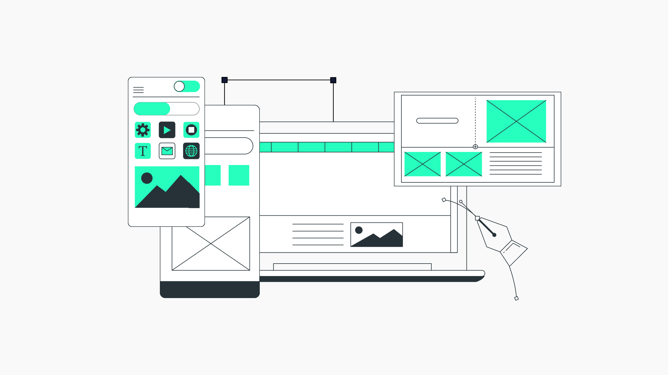
Best Practices for Using Whitespace in Web Design
Prioritize Important Content
When designing a website, focus on the most important content. Use whitespace to highlight it and make it stand out. Avoid the urge to fill every inch of the screen with information. Instead, concentrate on what is essential and use whitespace to draw attention to these key elements.
Start by identifying the main goals of your website. Is it to inform, persuade, or prompt a specific action? Once you know the objectives, prioritize the content that supports these goals. Use whitespace to create a visual order that guides users to the most important information first, ensuring they can easily find and engage with it.
Maintain Consistency
Consistent use of whitespace helps create a unified and professional-looking design. Set up a grid system or layout guide to ensure that spacing is uniform across the entire website. Consistent spacing helps users understand the content structure and navigate the site more easily.
A clear grid system provides a framework for placing elements consistently and proportionally. By sticking to a consistent grid, designers can create a sense of order and predictability, making it easier for users to navigate the site. Consistent use of whitespace also reinforces the brand's visual identity, contributing to a more polished and cohesive overall design.
Balance Elements
Balancing elements is the key to a harmonious design. Too much whitespace can make a website look empty and unfinished, while too little can make it feel cluttered and overwhelming. Aim for a balance that allows each element to breathe while maintaining a cohesive and organized layout.
Consider the visual weight of different elements when balancing whitespace. Larger elements, like headlines and images, need more space to stand out, while smaller elements, like text and icons, need less space. Experiment with different amounts of whitespace to find the right balance that enhances readability and visual appeal without making the design feel too crowded.
Group Related Elements
Whitespace can be used to group related elements together, making it easier for users to understand the relationship between them. For example, using consistent spacing between items in a list or between related images and captions helps users quickly identify the connections between them.
Grouping related elements with whitespace creates a clear structure that aids the user's navigation and understanding. This technique is especially effective for complex interfaces, like e-commerce websites or data dashboards, where users need to quickly find and understand related information. By visually grouping related elements, designers can improve the overall usability and effectiveness.
Enhance Interaction and Engagement
Whitespace can also improve user interaction and engagement. By providing enough space around interactive elements like buttons and forms, you make it easier for users to click or tap without accidentally selecting the wrong element. This improves the overall usability of the site and encourages users to engage more with the content.
Interactive elements, like buttons and links, should have enough whitespace around them to ensure they are easily clickable, especially on mobile devices where touch accuracy can be challenging. Sufficient spacing around interactive elements improves usability and makes the interface feel more approachable and user-friendly, too. This encourages users to take action and engage more deeply with the content.
Test and Improve
Designing with whitespace is not a one-size-fits-all approach. It is important to test different designs and get user feedback to find the most effective use of whitespace for your audience. We encourage you to conduct usability testing to see how users interact with your design and make changes based on their feedback.
Iterative testing allows designers to refine their use of whitespace and ensure that it enhances the overall user experience. By continuously testing and improving the design, you can achieve a balance that maximizes readability, focus, and visual appeal. User feedback is invaluable in identifying areas where whitespace can be improved to better meet your users' or customers' needs and preferences.
Conclusion
Whitespace is a powerful tool in web design that can greatly improve user experience, readability, and visual order. By understanding the importance of whitespace and using best practices, designers can create clean, balanced, and user-friendly digital interfaces.
The strategic use of whitespace helps focus users' attention, reduce mental effort, and improve overall interaction with the website. Effective use of whitespace can lead to highly successful and engaging web designs that connect with users and achieve the desired outcomes.
Whitespace allows users to navigate websites with ease, focus on what truly matters, and enjoy a more pleasant and efficient online experience. Do not underestimate the power of whitespace.