How to Effectively Visualize Data for Analytics Dashboards
Data visualization is one of the most straightforward ways to transform numbers and complex information into visuals that are easy to understand. In today’s world, companies collect data from various sources, such as sales numbers, customer feedback, and website traffic. To make informed decisions, data needs to be clearly visible and understandable. This is where data visualization plays a vital role.
Analytics dashboards are tools designed to display data visually, helping users quickly see patterns, trends, and essential information. The main goal of an analytics dashboard is to make data accessible and understandable. When data is well-presented, it helps users make decisions based on facts rather than guesses.
Choosing the Right Charts
The first step in creating an effective dashboard is selecting the appropriate charts and graphs. Not all charts are alike, and each type is best suited for specific kinds of data.
Line Charts
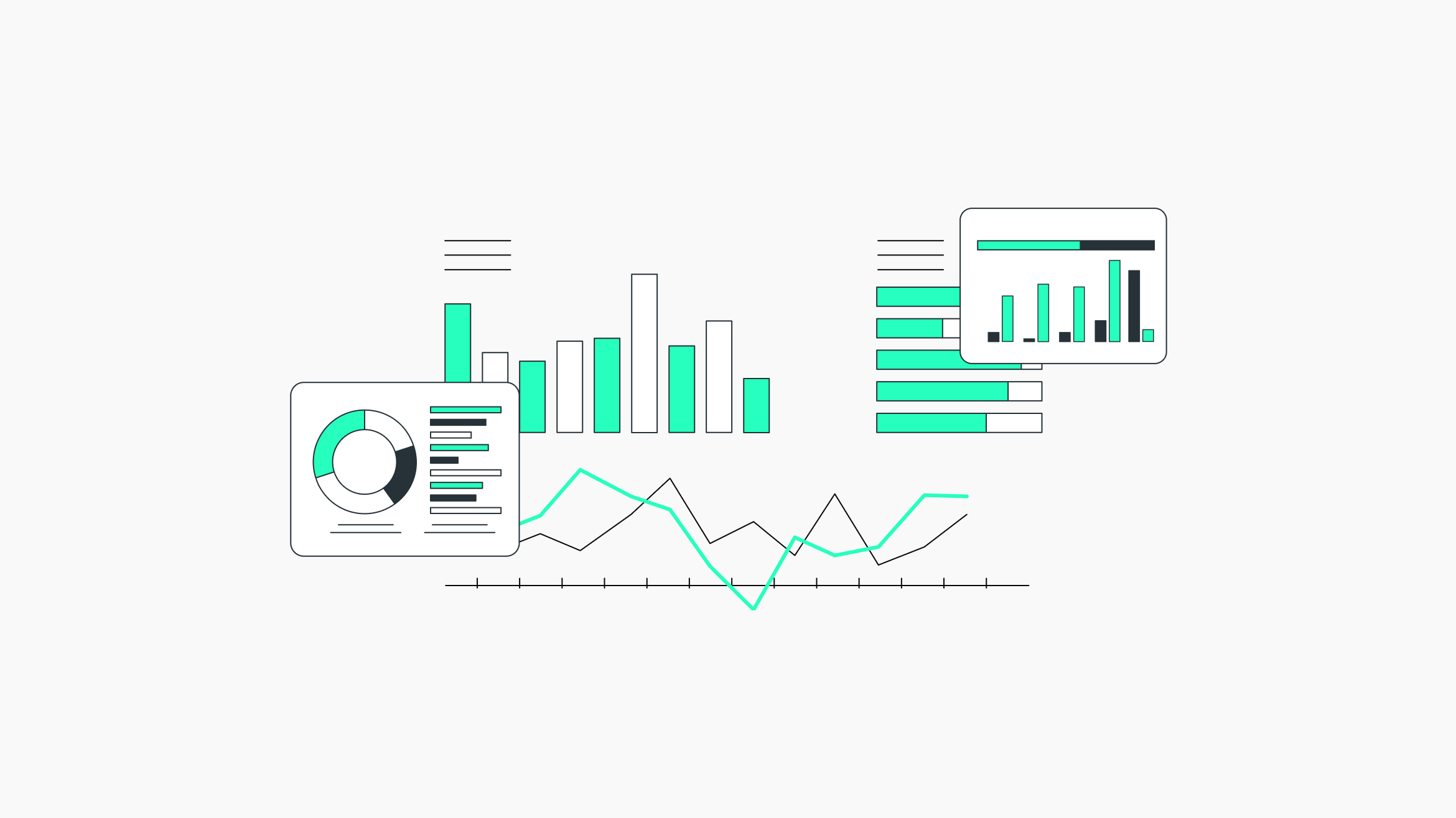
If you want to show how a value changes over time, a line chart is often the best choice. A line chart connects data points with lines, making it easy to observe trends, such as whether numbers are rising or falling. Line charts are particularly helpful when comparing trends across different periods, like months or years.
Bar Charts
For comparing different categories, a bar chart may be more effective. Bar charts use varying bar lengths to show differences between categories. For example, to compare sales across different products, a bar chart clearly displays which product sold the most and which sold the least, offering a straightforward tool for comparison.
Pie Charts
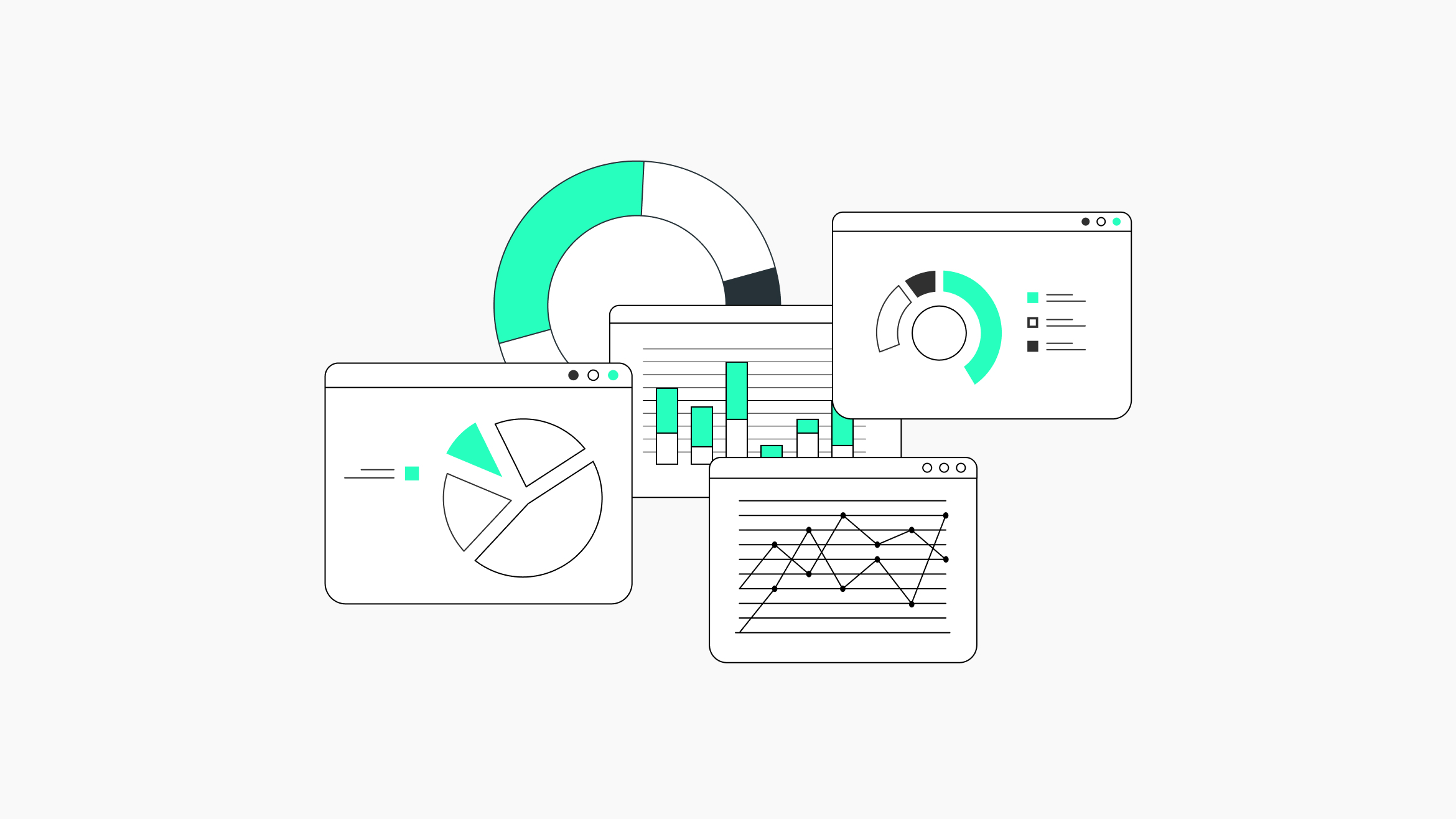
Pie charts are useful for showing parts of a whole. For instance, to illustrate how a company’s total revenue is divided among different products, a pie chart can be effective. However, if there are too many slices, pie charts can become confusing. It’s best to use pie charts only for a few categories; too many slices make the chart harder to interpret.
Chart Combinations
For complex data, a single chart may not be sufficient. In these cases, you may need to combine charts. For example, you could use a line chart for overall sales trends and a bar chart to break down sales by product. Combining charts can provide a more comprehensive view of the data. However, it’s essential to ensure the charts complement each other and do not overwhelm the user.
Scatter Plots
Scatter plots are another valuable chart type, used to show relationships between two variables. For instance, you might use a scatter plot to explore the relationship between advertising spend and sales revenue. Each point on the scatter plot represents a pair of values; if the points form a clear pattern, this may indicate a relationship between the variables.
Heatmaps
Heatmaps are also useful for data visualization. They display data in a matrix with colors representing values. For example, a heatmap might show website traffic, with darker colors indicating higher traffic. Heatmaps excel at revealing patterns and trends in large datasets.
Lastly, remember that not every chart will be equally effective for all users. Some users may find certain chart types easier to interpret than others. It’s essential to consider the dashboard’s target audience and choose charts that best convey the data to them.
Information Hierarchy
After selecting the appropriate charts, the next step is organizing information on the dashboard, known as information hierarchy. This involves determining which data is most important and positioning it prominently.
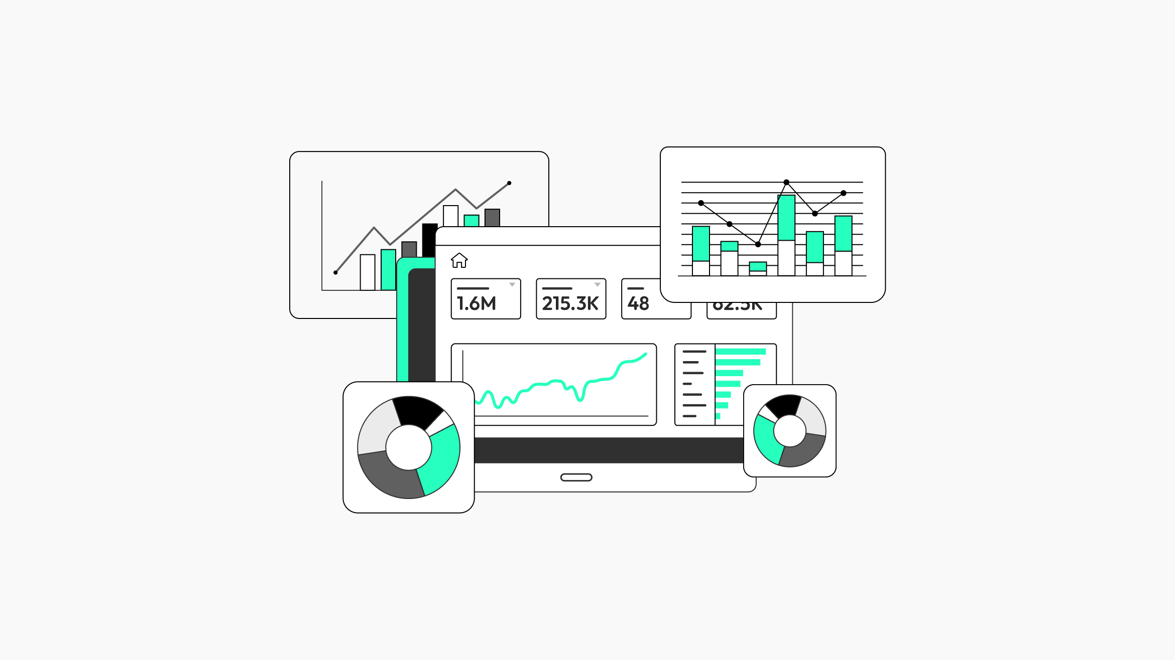
The most crucial information should occupy the most visible areas on the dashboard. For example, key performance indicators (KPIs) like total sales, profit margins, or customer satisfaction scores (CSAT) should be at the top or center. These numbers provide an immediate overview of business performance.
Supporting data or details can be placed in less prominent areas. For example, if the main KPI is total sales, you might include detailed sales data by region or product in a section that’s easily accessible but not the dashboard’s focal point.
Color is another tool for establishing a clear information hierarchy. Bright or bold colors highlight the most important data, while softer or neutral colors can represent background information. However, avoid using too many colors, as this can make the dashboard appear cluttered and difficult to read.
Font size and style can also help create an effective hierarchy. Larger fonts can be used for primary information, while smaller fonts suit less critical details. Consistent font styles, like bold or italic, can guide users’ eyes toward essential data.
Consider how users will navigate the dashboard. If it has multiple sections or pages, users should be able to move seamlessly between them. Clear labels and a logical layout will help users find information quickly.
Interactivity
Interactivity is an essential feature of modern analytics dashboards. A static dashboard can display a lot of information, but interactivity allows users to explore the data, apply filters, and customize their view according to their specific needs.
One common interactive feature is drill-down functionality, enabling users to start with a high-level view of total sales and click to see specific data, like regional or product sales. This feature allows users to focus on relevant data without being overwhelmed by too much information at once.
Filters are another key interactive feature, allowing users to view only the data they need. For instance, users may filter sales data by time, region, or product category, focusing on what’s most relevant to them.
Some dashboards include interactive charts, where users can hover over data points for more information or click on them to see related data. For example, hovering over a bar in a bar chart might display its exact value, or clicking on a line in a line chart might show a detailed data breakdown.
Another useful feature is the ability to customize the dashboard layout. Some users may prefer certain data first or wish to arrange charts in a way that’s most meaningful to them. Customizable layouts enhance user-friendliness and dashboard effectiveness.
Interactivity should be intuitive. Complicated steps might frustrate users, reducing dashboard engagement. Interactive features should enhance the user experience, not complicate it.
Storytelling Through Data
Data storytelling is a critical component of a useful analytics dashboard. Data becomes more meaningful when presented as a story. A good story in data visualization has a beginning, middle, and end, guiding users through the data and clarifying insights.
In an analytics dashboard, storytelling might start with a high-level overview of key metrics, giving users a quick snapshot of essential data. The dashboard can then guide users to more detailed information, showing how different factors contribute to overall performance. Finally, it might provide insights or recommendations, helping users understand what actions to take.
Annotations or explanations can enhance storytelling. For example, a dashboard might include notes explaining the metric's importance or the trend's significance. This helps users interpret data accurately, making the dashboard a more valuable decision-making tool.
Visual hints like arrows or colors can show changes over time or highlight key trends, helping users quickly grasp the most crucial points.
However, keep the story simple and focused. Telling too many stories at once can confuse users, making the dashboard harder to use. Focus on the most critical insights and present them clearly.
Design Considerations
Good design is essential for an effective analytics dashboard. A clean design is functional, attractive, and easy to use. Several design principles can help achieve this balance.
First, simplicity is key. A cluttered dashboard can be overwhelming. Focus on the most relevant data and avoid unnecessary details. White space, or empty space around elements, can create a clean, organized look, making the dashboard easier to read.
Consistency in design is also important. Use the same fonts, colors, and styles throughout to create a cohesive look. Consistency helps users quickly identify patterns and relationships.
Readability is critical. Text should be legible, with a suitable font size for various screen sizes. Colors should provide a good contrast between text and background. Avoid too many fonts, as this can make the dashboard appear chaotic.
The dashboard layout should be logical and easy to follow, with the most important information in prominent areas. Related data should be grouped together, and the layout should be flexible enough for different screen sizes, from desktops to mobile devices.
Finally, consider users’ needs and preferences. The dashboard design should be user-centered, considering their technical skills, devices, and business context.
Empowering Users with Data
The ultimate goal of an analytics dashboard is to empower users to make data-driven decisions. This requires making the dashboard intuitive and easy to use. If users can find the information they need and understand it quickly, they’re more likely to use the dashboard regularly and make informed decisions.
Accessibility is also crucial, ensuring the dashboard works well across different devices. Accessibility includes accommodating users with disabilities, such as compatibility with screen readers or providing alternative text for visual elements.
Lastly, empower users by providing the support they need to use the dashboard effectively. This could include training, tutorials, or help features that guide them through dashboard functionalities.
Conclusion
Data visualization is an essential element of any analytics dashboard. By selecting appropriate charts, organizing information effectively, incorporating interactivity, telling a story with data, and focusing on design, it’s possible to create dashboards that are functional, intuitive, and empowering.
A well-designed dashboard helps users understand complex data quickly, enabling them to make better, data-driven decisions. By centering on user needs and creating an informative and easy-to-use dashboard, companies can unlock the full potential of their data, driving better business outcomes.

